
Space Admin Portal Overhaul
WEWORK / TEEM
For me to explain Space Admin Portal, I need to explain Teem, which was recently acquired to wework. Teem’s main solution was managing office space, and within that, a power user will need to manage, create, and remove that space digitally so it can be tied with our software.
Tasks
Product Strategy
Research
Interviews
Journey Mapping
Visual Design
Interaction Design
Problem
Wework acquired a great system, but the software was very frustrating too many of our clients. Fragmented navigation, inconsistent patterns, & no clear direction on what is likely to be the next step. This was constantly brought up, before and after I joined the team.
Objectives
We offer many solutions too many office problems, but the discovery of these tools is poor. The User is normally the Admin IT within the company, and this person has many things to do outside of managing space, an experience where they don’t have to spend any unnecessary time within out product is a big win.

What are users saying? where could we improve?
Based on heuristic evaluations and user feedback, there were some clear paths to improvement. We were failing pretty hard with consistency/standards & flexibility/efficiency. Constantly, our navigation was brought up as a pain point by many of our enterprise clients, this prompted us to go back to the skeleton of our solution and rethink our product.


Journey
Understanding specific experiences throughout their use of our product allowed us to clean a lot of the clutter out of our old navigation.


Foundation
Breadboarding the design was our first attempt to understand the problem, this included post its, white-boarding and a couple of meetings with different departments to validate the consultation of our heuristic evaluation.
A Comfortable Narrative
Our system architecture was built on features not on users. We looked into ways to group information in workspaces & Journeys to allow people to be more efficient.

The Meaning of Color
Before the exploration of problem discovery, we branded to a language called Rey, problematically it did not work well with creating direction with a complicated product like ours. allowed us to rethink how visual components will be represented to give the user the best route for success.

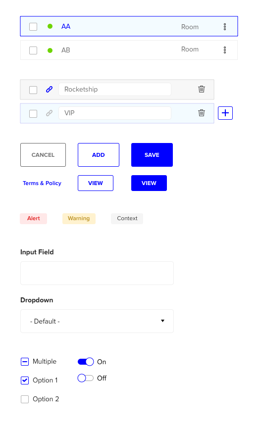
Modular Design
With modular components, we can give information that relates to areas where our users can focus, address, and leave our product within minutes.

The End of the Beginning
When overhauling a project, new components & patterns will likely be created in order to fit the UX of a product. This also allowed us to start a conversation around updating the design system.
Conclusion
To conclude this case study, we were able to achieve success with our stakeholders. This has also sparked conversation around supplying our customers with insights as a tool to understand the value we offer, rather than offering it as a paid feature. This will allow us to monetize items we gave away for free because we were unable to communicate its value without the data.
